Saffy’s
Brand Identity, Hospitality Design
Studio: LFNCO
2022
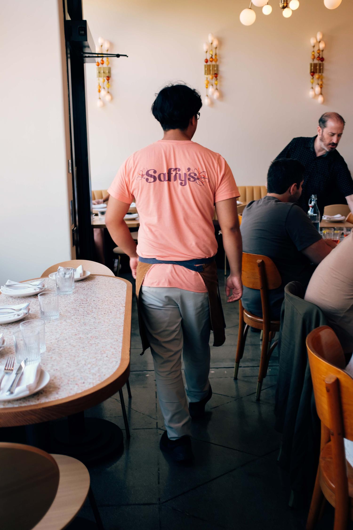
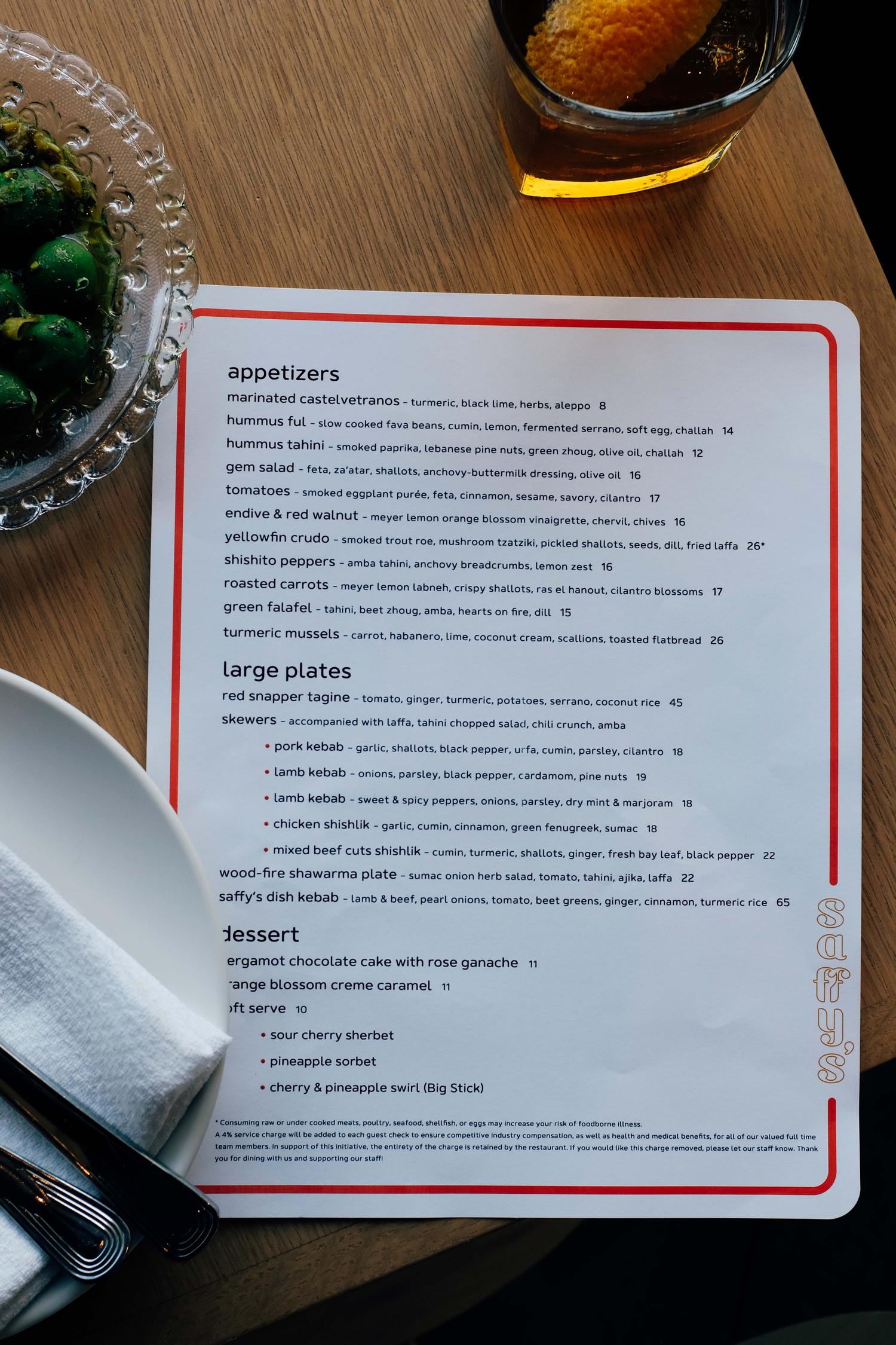
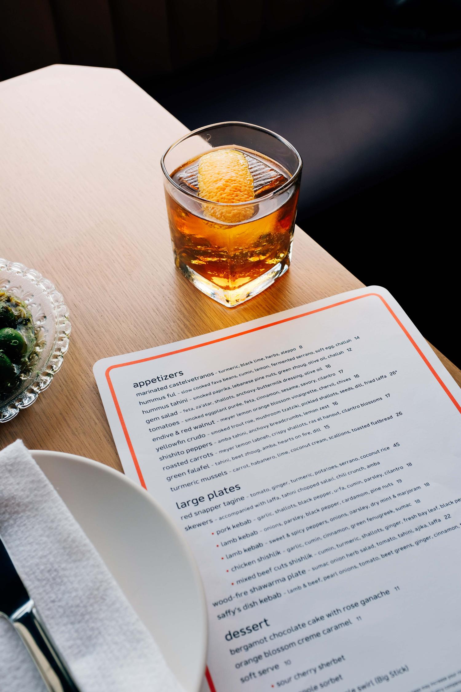
Saffy's concept draws from Ori and Genevieve's broad Middle Eastern perspective — including Egyptian and Israeli influences found in paintings hidden within the space. The brand designs merge these influences with the art deco lines of the building. Custom typography, packaging, illustrations, hidden paintings and gilded exterior signage adorn the space.


Iterative Health
Branding, Visual Design, Digital Design
Studio: Pineapple Studio
2023
Iterative Health’s mission is to advance global healthcare by developing AI-powered tools to enhance disease detection and patient care. Inspired by their founder’s commitment to expanding healthcare access, the company addresses the urgent need for early colorectal cancer detection, one of the most preventable yet fatal cancers. Through innovative, AI-driven insights, Iterative Health empowers physicians to deliver timely, accurate diagnoses, setting a new standard in precision healthcare worldwide.
Pineapple conducted a thorough brand strategy audit and collaborated with Iterative Health to create an updated brand strategy and messaging platform. This insight led to the name change from Iterative Scopes, which confused customers, to Iterative Health, reflecting a broader portfolio and impact on human health.
Pineapple conducted a thorough brand strategy audit and collaborated with Iterative Health to create an updated brand strategy and messaging platform. This insight led to the name change from Iterative Scopes, which confused customers, to Iterative Health, reflecting a broader portfolio and impact on human health.


